Happy to announce that my new children's book is now available on Amazon . Nice rhyming read and fun ending.
link is https://www.amazon.com/dp/B0CKGN6FGQ
Tuesday, November 28, 2023
Paintings 1970 to 2022 George Ladas
Wyoming Landscape - Oil
Prague Cathedral - Oil 1963
Canyon Pools - gouache 5 x 7 in
Roping Steers - Oil 11 x 14 in
Path to House - gouache 5 x 7 in
Path to Landing - gouache 5 x 7 in
Rock Study - gouache 5x7 in
Wyoming Landscape - oil 8x10
Vermont Hill - oil study
Francis Belden - Pitchfork Ranch, Wyoming 1976
Bear Study - oil
Big Tim - gouache study
Rodeo Guy - Cody, Wy 1976 watercolor
Wyoming Mountains - oil 30x40
Yellowstone Falls - oil 30 x 40
Canyon Pools - gouache study
Saturday, January 14, 2023
Final rendering for the HSP commission from NASA 1990
This project was fraught with difficulties. Not only for the telescope itself but for the completion of the assigned commission of the proposed cutaway rendering as well.
Deeply saddened by the passing of life long friend, college and
studio mate Chuck Ginnever seen here with me on the right. Please view his
outstanding bio at Wikipedia. https://en.wikipedia.org/wiki/Charles_Ginnever
Audubon Tyler taught at the Art Center School during the early 60's..I was fortunate to have him as an instructor between '60 to '63.
His history included work for the major film studios painting period
portraits of stars and copies of master works that were to be destroyed
in the narrative of film. I have included what I could dig up on the
web re: what he told me to fit the current entry.
Named after his grandfather James Audubon the naturalist, Tyler was a classically trained skilled portrait painter. He gave classes in head painting and drawing but offered much more in that he stressed the ability to really look at your subject and break down what you are seeing in terms of value placement... the simple largest shape of light and dark area. Basic painting...get it right the first time around..
He Spoke of working on the Picture of Dorian Gray which I have included on in this blog. The credit for the portrait ( the before ) by the studio went to Henrique Medina, a Portuguese painter who often worked for the studio system..The story I heard is that both worked on the before painting as there is a transition between the very first shot of the portrait and one seen later as slightly showing a slightly hardened look.
I feel that the first painting seen in the film was the second retouched or 'sweetened' original portrait done by Tyler as it has the feel of his other work as opposed to the soft look of Medina's work.
I offer examples broken into sectional divisions that show how the painting was altered to sweeten the head.
charcoal sketch probably done by Tyler
Top is sweetened by Medina? Lower by Tyler- Check the difference in the eyes - the right eye is off a bit in the sweetened.
The second shot of the portrait in the film is just a cut to the head revealing the supposed hardening and does not have to be in sequence as scenes are generally shot out of sequence anyway.
While I was taking classes in illustration at the Art Center School I got lucky...I found a job working the door at Shelly's... Mutt Cohen who ran the Unicorn Coffee House on Sunset mentioned that Rudy Onderwyser was setting up a new jazz club with Shelly Manne and that I should see him about a gig part time ... It would not interfere with day classes and would be perfect for the weekend and maybe a day in between... The Unicorn Coffee House was in itself interesting as many of the great and not so great would pass through to take in an original coffee house folk scene...Freddy Engleberg, Harry Dean Stanton would jam blues before the show generally in the front ...sometimes in the rear courtyard...there was a neat little bookstore on the second floor in the back run by a couple that I met where I was living at the time and they put me on to that whole unfolding of the semi-beat coffee house evolution.
Rudy in the office upstairs
Rudy was a piece of work...He gave me a job on the weekends filtering out the peculiar ones; potential hot tempers or whatever and seating the serious jazz-a-philes. I had to give up the job two years later due to tough classes... I understood that a new hire replacement got into a real flap over not letting somebody in with heavy pull over the one dollar weekend door charge. 1608 North Cahuenga was in the heart of Hollywood and everybody wanted freebees by saying they were a friend of Shelly's...Shelly had a lot of friends..)
On a visit back years later in the eighties Rudy said that they were tearing the building down And I went down to see for old times sake...The workers said they were going to dig up the sidewalk also along with the real man hole cover embedded in the concrete.. I ran down to an art store and picked up some large Strathmore sheets and some graphite and made three rubbings.
When Shelly first leased the space it was full of wild odds and ends - It kept getting added to from all sources... You can see the Schweppes man full size cut out in the upper right over the kitchen fitted with an apron and assorted beer coaster badges...also another blindfolded cutout serving a tray of beer. I donated a giant 7 foot Greek flag which hung in the back near the light between Richie and Monty in this shot.
Russ Freeman replaced Victor Feldman and Chuck Berghofer took Monty's place as the regular weekend group...Shelly paid scale - about $16.50 per night...!
This is a clip of Shelly and the group is from a TV show that featured jazz stars of the time in LA...very nostalgic for all of us old enough to remember...
After the first 2 years the space adjacent to the club (American Cancer Society) became available and they annexed it creating a much better venue for both musicians and patrons. I found this sketch I made at the time in a journal showing the changes being made..the drawing is obviously not exactly to scale but shows the three levels that existed in the new club space ( the 1st being the highest to the 3rd a few steps down.)
Richie Kamuca
Richie and I stayed in contact also as he moved back east with the Merv Griffin Show and then back to LA in '70 ... I visited him in La during a rehearsal Of the Griffin show and during a break he doubled over in his seat a groaned in pain... I asked him if he was OK and how long has this been going on... he said that he would see a doc soon...He passed a short time thereafter with cancer at 46...
Doris, his wife told me when Shelly came to see him in the hospital he asked Richie if he could do anything..
Richie replied "yeah...take my place..!" Rich was a super talent and a loss to the jazz scene..
Sam SanAntone serving up
Dinner before opening w/ Tony
After the renovation Shelly booked in Miles for a week.. this was a major event...
Rudy called me in to work the door as Art had a bad foot. I had left the Manne-Hole the previous July due to a heavy class schedule but was happy to fill in..
Miles stayed in the Hollywood Roosevelt Hotel and put up his sidemen (George Coleman, Frank Strozier, Harold Mabern) in the now defunct Argyle Motel. I Think that Jimmy Cob did the gig on drums but can't really recall that - Ron Carter on Bass. I offered to take George and Frank down to Vic Tanny's Gym in Hollywood for a little exercise in the day - George came with me and Frank stayed behind...After the workout I took over a bottle of Metaxa 7star and took a few shots of a very young group of really gifted musicians.
George Coleman
Frank Strozier
George Coleman
Harold Mabern
Harold Mabern
I found these menus from the club stuck inside a record jacket of the double album of Shelly & His Men recorded in '61 in the club.
Wish that these prices were still around... It was a very affordable night out with great sounds.
Poster from Wednesday Night Promo
One night Tony Curtis sat in with Paul Horn and played a few passable solos on flute....
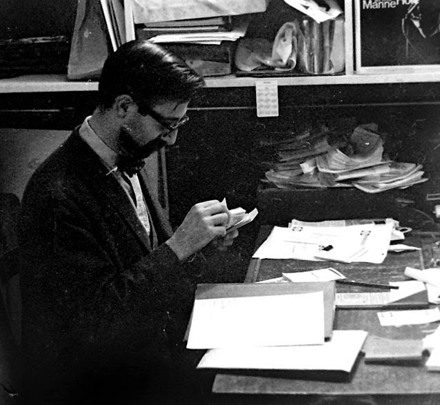
Rudy going over receipts
Rudy, Sonja and Poof-Poo in the late seventies
I kept in contact with Rudy and Sonja every year after leaving LA until about 2010 when the phone went quiet and email disappeared...Rudy went down to run the Lighthouse after Shelly's closed and then tried to keep a place called Hop-Sings going... He said it didn't hop and didn't sing either...it pooped out.. Nobody was going to clubs anymore..
During the short few years at the door and in the club anybody who loved jazz in Hollywood would show up during the week.. Clint Eastwood, Dave Raskin, Billy Wilder, Johnny Mathis, Julie London, Dizzy... tons of actors and actresses on the way up and down...I recall Sal Mineo bringing in Tuesday Weld and Shelly introducing only Sal... Tuesday Weld was already just as well known at the time and think she was a bit miffed.
One of the best sessions at the Manne-Hole was with the Bill Evans Trio in May of '63... I was happy to be there during the recording and still find this album as a favorite...with Chuck Israels and Larry Bunker....
I hope to add to this entry and if anyone out there has anything to correct or add please contact me..
There is a great blog on jazz profiles at this link.. It covers a lot of inside moves of the club etc..
Most beginning students find drawing animals difficult as they usually like moving around.
If you find a good photo you can practice analyzing the form unfettered by a restless subject...Sleeping dogs need not apply..
Below are a few quick studies that were used for some gouache paintings done for the original owner of the Provence Restaurant Jean Michel and his lovely wife. They passed them on to their friends and neighbors at Coach Farms in Connecticut.
Find the forms the shapes of the animal takes naturally...rectangle, cube, egg, and see if it fits. The body parts are naturally divided into symmetrical halves. Use this natural dividing line to hone your observational skills and get the form down on paper or canvas with solid authority.
look for the center-line down the body and head
gouache 4 x 7
best dog Tim - 3.5 x 7 goauche
Roping steers -Cody, Wyoming - oil 8 x 11
these blue-lines were preliminary motion studies for an animatic
adding the thick and thin lines by pushing and pulling your pencil helps the feeling of action and the fur of the subject
by using straight lines against curves helps give a little punch to the forms


